Going with the flow in comics
“Flow” is a term that is often used by comic creators to describe how well a comic page directs its readers through the panels. This notion is discussed a lot, but there has actually been very little work trying to specifically describe what “flow” is, how it works, and how often it occurs.
This is the topic of our recent paper, “Going with the flow in comics” (journal site, open access pdf), where we provide some theory on what flow is and then analyze flow in 417 comics from around the world in our TINTIN Corpus. Here I’ll provide a basic breakdown of what we cover in the paper.
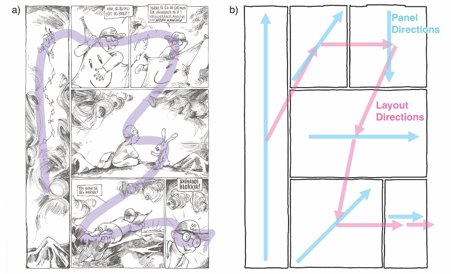
First, what is flow? Flow is basically how well the content of a panel suggests the direction that a reader should go to reach the next panel in the layout. This is a type of relationship between directions implied by the content of panels (what we call “internal compositional structure”) and the directions between panels (“external compositional structure”). So, if the content of the panel implies a direction that lines up with the direction toward the next panel, you have an example of “good flow.”
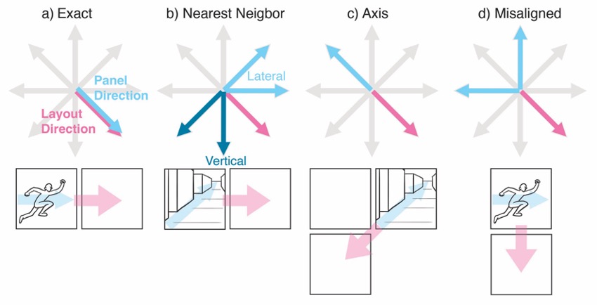
However, it’s a bit more complicated than this. Directional alignment can occur in several ways. Exact alignment is when the direction implied by the panel contents is the same as direction of the next panel. However, sometimes you might have only one aspect of that direction line up (nearest neighbor alignment), like if a panel implies an up-right direction but if the actual panel is just to the right. Here, the rightward part is enough to say they are aligned. It might also be that the panel has more of a line or vector associated with it’s directionality, not a single direction, so a panel that might be seemingly going the exact opposite direction may still have good flow (axis alignment).
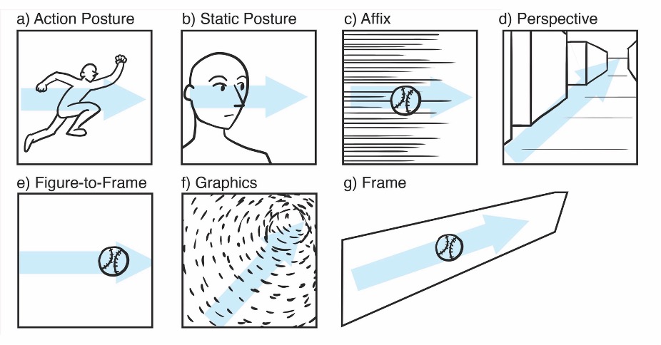
There are lots of different cues in a panel that might suggest directionality, and thus flow. These are the action postures of characters, their static postures (including their eye gaze direction), “affixes” like motion lines, the contours of perspective lines (typically aiming towards a vanishing point), the orientation of a figure relative to the frame, the shapes of panels, and more. Many of these cues have been shown through psychological research like eye tracking to direct viewers’ attentions or give a sense of implied directionality.
So, we analyzed these properties of flow directions and flow cues in a subset of our TINTIN Corpus, here analyzing 417 comics from 103 countries, spanning 23,169 panels. Along with flow cues, we assigned panels to the eight basic directions (up, down, left, right, and in-betweens), centered, inward, outward, and none. For layout directions, we automatically extracted the directions of panels between each other in a layout, using the technique from this paper about layout. We then calculated how often the panel directions lined up with the layout directions…
Overall we found that on average 49% of panels in comics used flow alignment (i.e., they had panels with suggested directions that lined up with the direction of the subsequent panel in the layout). Typically sequences of panels that maintain flow only lasted 2 to 3 panels long. There was also a high amount of misalignments (37%).
As we say in the paper, it’s worth remembering that misalignments or lack of flow can also be functionally useful to (hypothetically) slow a reader down or make them linger in a panel, rather than be pushed through all parts of the layout. The result would then be that reading of a comic page uses flow alignment to push a reader forward, then they stop, then forward, then stop, etc., resulting in a prosody or rhythm to the reading experience. So, lack of flow can be just as important as having flow, so long as it’s used the right way.
The “styles” of comics were more predictive of the data than the locations around the globe where the comics were produced. These styles also differed in how much they suggested flow, with realistic comics having the most flow alignment, and manga with the least.
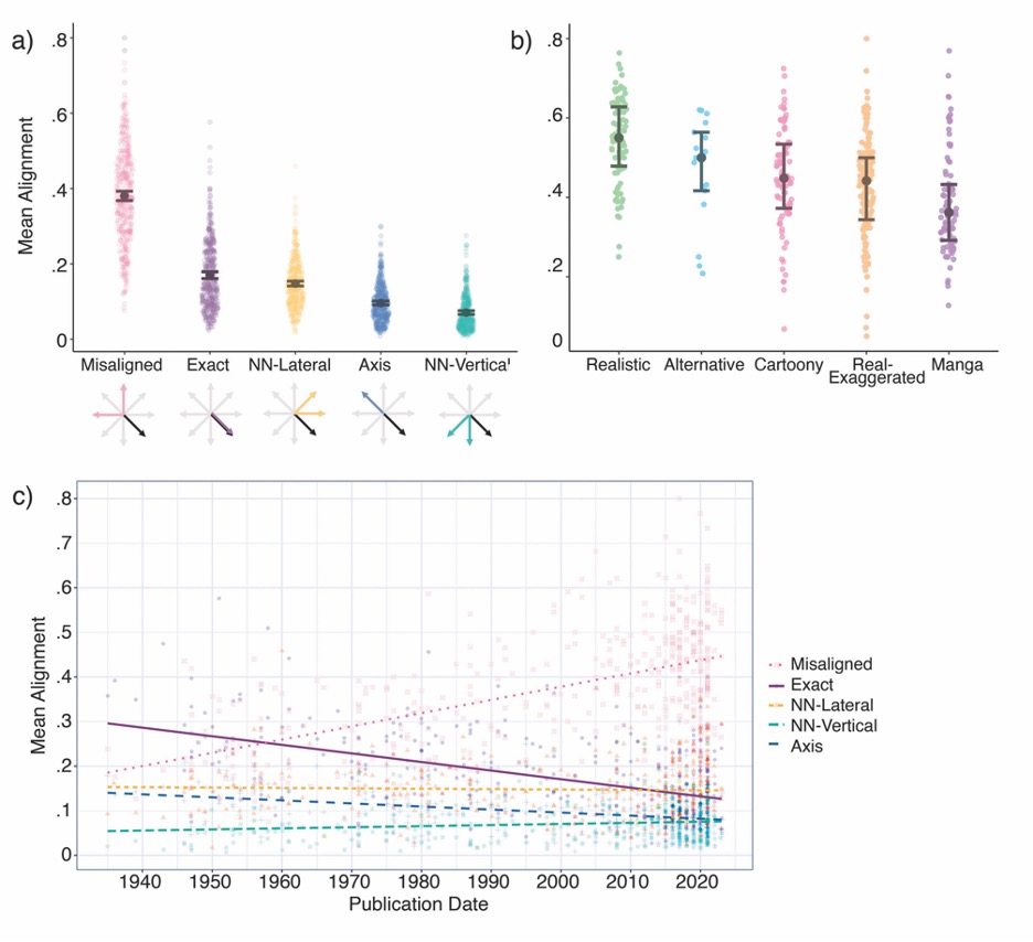
We also see that the rates of flow alignment overall have been decreasing over time in comics from the 1930s to the 2020s. That is, in general comic pages have been using less flow alignment, and more misalignment between the panel directions and layout directions.
Characters’ static or action postures were by far the most common cues used to signal flow. These have also been changing over time though. Static postures have been increasing as flow cues while action postures have been decreasing, along with other changes in the various other types of cues.
Altogether, this project let us hammer down specific definitions and constructs for what flow is and how it works, and our corpus let us examine how it actually manifests in comics around the world. The next question would be whether flow alignment actually results in the effects that have been claimed by comic creators… does flow alignment actually direct a reader’s eyes towards the next panel?
As we review in the paper, there is research showing that the types of cues (like people’s postures or eyelines) can direct attention, but there’s also mixed results in psychology studies examining eye-tracking of other compositional elements claim to “move a viewer’s eyes” in artwork. No studies have yet examined this in comics though, so it’ll make for an interesting next step in the study of flow in comics.
Journal article discussed:
Cohn, Neil, Filip van der Vegt, Fred Atilla, and Bruno Cardoso. 2026. “Going with the comics flow: A theoretical and empirical basis for flow in comics.” Journal of Graphic Novels and Comics. https://doi.org/10.1080/21504857.2025.2593920.
Journal website • Open access preprint (pdf)
Interested in more about the science of how comics work? Check out my 300+ page graphic novel, Speaking with Pictures, about the structure and cognition of language, comics, and visual communication!

Comments