Comic Theory 101: Visual Poetry
This article was originally written for my periodic column at the online magazine Comixtalk in November 2006.
In this column I’d like to continue our discussion of the potential for visual language poetry that I began way back in my last column, with visual rhyming. At the end of that column, I created a visual poem by borrowing the verbal patterns of a limerick.
However, much of the nature and power of poetry comes from the natural features of the language that they are designed for. Sonnets and limericks use the power of the meter and rhyme found in the English language, while haiku utilize the syllabic structure of Japanese. While haiku in English might be fun, they fail to capture the essence that those in Japanese do, and rhyming in Japanese is far less interesting, since it’s a syllabic language from the start. The poetic style is a reflection of the language it appears in.
So, if we would like to formalize certain tropes for visual language poetry, what structural features are available to us?
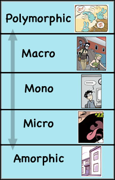
In previous articles, I’ve mentioned that we can quantify types of panels by the amount of “entities” in them — the “characters” engaged in an action.
At the highest level, Polymorphics* contain a full action, by repeating entities over and over again.
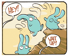
Macros hold a full scene, with more than one “entity” in them.
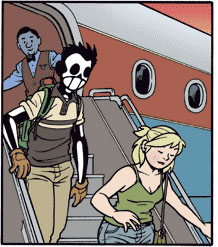
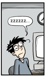
Micros contain less than one entity – often through a “close-up” shot.
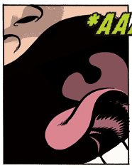
Finally, at the lowest level, Amorphics have no active entities at all – they only show elements that are not engaged in the action, perhaps of the surrounding environment. (* For those keeping score, yes, this is the first time I’ve mentioned this category).
We can graph these descending panel quantities in what I call the “Lexical Representational Matrix” or “LRM”*:
For poetic purposes, these various levels can be utilized in the same manner of syllables; they allow for a quantity of “beats” depending on how much information they hold. Let’s pose a hypothetical poetic line:
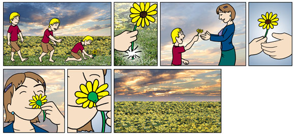
Polymorphic – Micro Refiner – Macro – Micro Refiner – Mono – Micro Refiner
Here, the poetic aspect would come from traveling down the LRM, with an alternation of Micros between each panel. By “Refiner,” I indicate that the Micro plays a grammatical role of “zooming in” on an aspect of whatever panel it follows (see my [EDIT: book The Visual Language of Comics for further] discussion of this).
Here’s what a poetic line of this fashion could potentially look like:
Now that we’ve established what the content is, how about we add another aesthetic/meaningful layer to it?
Poetry often uses a certain length of line or stanza, which we can adapt conceptually to the idea of layout. In the visual form, the size of panels and the shape of their arrangement can invoke certain feelings or allow various things: large panels allow for a expansive space, thin panels might feel cramped.
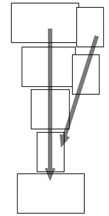
Bearing in mind the “narrowing” property of my poetic line above, how about we add this to a layout that starts off big, then grows smaller, emphasizing the alternation in the layout. Perhaps the Micro Refiners can overlap the panels they modify — except at the end, when the Micro is still a Refiner but represents the bottom of the LRM. Here, the variance of the layout is modified to emphasize a different part of the structure. The formal properties would then look like this:
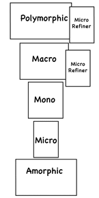
Notice that there are two main aspects heightened by the layout. Along the vertical plane is the reduction of the major categories of the LRM. Meanwhile, along the diagonal we find a row of Micros with similar content, but highly refined viewpoints. This diagonal emphasizes the feeling of narrowing of information. Both of these lines converge upon the Amorphic panel – reducing substance and refining substance, both focused down to a releasing point of no active elements at all.
All together my example from above becomes:
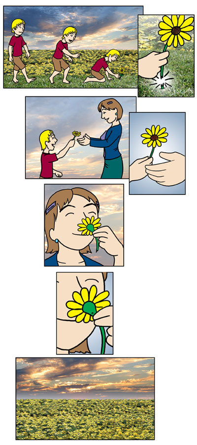
Voila! I’ve just created a formal type of poem for visual language. I dub this type of poem a “reducto,” for its features of narrowing information as it goes. Admittedly, my example here perhaps doesn’t reach the full height that the Reducto formalism could attain, and I’m sure you all could think of far better content to fill in your own works (hint hint).
However, this is just one example of infinite possible combinations of LRM values and layout (and potentially visual rhyming!) that people could think of and toy with poetically. To me, the important thing is that it reflects and plays with the attributes of the visual form itself.
So, put on your thinking berets, come up with some traits to play with, start a meme, and let’s all become visual poets.
************
* It should be noted that later theorizing removed panels with polymorphic representations were from the “LRM” hierarchy (“LRM” as a term is rarely used anymore either, and has since been changed to “AFM” for “Attentional Framing Matrix”). Instead of being considered as a “type of panel,” it is now considered a type of visual language “morphology” that can be applied to any panel type. Ah, how theories change! Regardless of the theory though, the poetic form stands without needing alteration.
Postscript: Since this article appeared back in 2006, several theoretically minded creators have created their own reductos, and sometimes new visual language poetic forms as well. The most noteworthy of these endeavors come from Grant Thomas, and Two for No by Alexander Danner and Tym Godek. Go check them out, and make your own!
Comments