Comic Theory 101: Passing Judgment
This article was originally written for my periodic column at the online magazine Comixtalk in January 2006.
By now, most readers of this site know that I have been developing a theory that sequential images can actually be a language. Combined with written language, this visual language is found primarily in the cultural artifacts that we all enjoy call “comics.” While this might not sound too controversial up front, I’ve pointed out that full acceptance of this perspective leads to very different conclusions about the nature of graphic representation than our culture currently has under an “Art” perspective.
Since comics are so graphically rich, the Art perspective generally dominates our perceptions of it. One of the differences from the Language approach is an issue of “acceptability” of various expressions. In Art, we accept everything as being “okay,” and make justifications for things that don’t seem straightforwardly right. Rather than admitting they are unusual, we make reasons or justifications for how they might make sense with a particular interpretation.
Take for instance the class of “non-sequitur transitions” for panel relationships that don’t have any apparent connection with each other, with the reasoning: “Don’t worry, its still Art, it has to make sense somehow!” But really, though, do we have to think it makes sense on a direct level of understanding?
Now, I’m not saying that people shouldn’t use these jarring nonsense panels. Indeed, they might serve a purpose to the overall “literary” message of the piece. However, this doesn’t mean that they connect meaningfully to panels around them. And nor should they have to. This is the illusion cast by the Art point of view.
In contrast, the only time that we allow odd language is when we accept it under this Art perspective – like in poetry or narration in a Frank Miller comic. But, writing a paper or speaking in this way normally would be incredibly weird!
Indeed, in language, we can recognize that certain things are completely unacceptable, in comparison to those that are well formed. For instance, a sentence like this should feel really bad (indicated by the asterisk):
* Himself threw the ball to Kelly.
Now, this sort of ungrammaticality is different from the “grammar” that most of us learned in school, which taught us how we should and shouldn’t write. Now, I say this at the risk of upsetting all the editors out there, but, in fact, by linguistics standards most of these aren’t actual rules of English!
These “rules” of grammar were actually written in the 1800s by people enamored with Latin. These Latin rules are the ones our “English class” grammar is based on. In Latin, ending a sentence with a preposition jolts the system like the sentence above does for us, but in English, it isn’t really ungrammatical. In fact, I just did it two sentences ago.
Ending a sentence in a preposition and other aesthetic rules of grammar don’t elicit the same kinds of gut level feeling of wrongness that the example above does. This is because the one above violates principles in our minds that generate language, as opposed to just the cosmetic rearranging of words that aesthetic grammar gives.
In the 1950s, the linguist Noam Chomsky pointed out that we can use our intuitions about language to figure out about these underlying principles. Because fluency in a language enables us to discern what’s bad from what isn’t, our own judgments can act as a tool for figuring out what’s wrong with truly ungrammatical sentences.
I believe that we can do this in the visual form as well. There is a reason that people often find non-sequitur panels unusual and jarring: it’s because they usually don’t make sense in the grammar of sequential images! In various projects of my research, I’ve uncovered what I think are some particularly odd examples, and have relied on my and others’ intuitions to figure out explanations for why. And, given that most of the people reading this column have some fluency by reading comics, you should have these intuitions too.
Now, I have my own theories about why things work the way they do in this visual language, but I figured that these columns should give you all a chance to jump into the realm of theory too. So, here I’ve presented a series of variations using the same panels in different orders. Some of these I find to be odd, others not so much. Based on this data, see if you can offer an explanation for any judgments you derive:
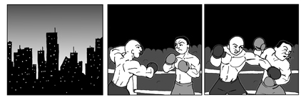
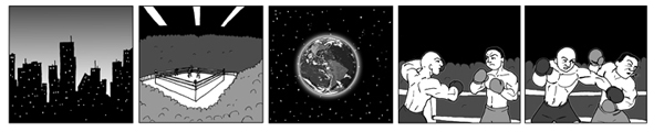
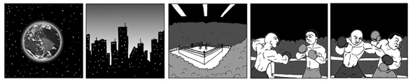
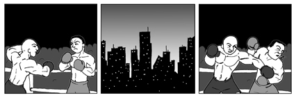
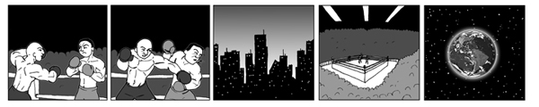
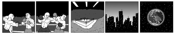
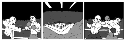
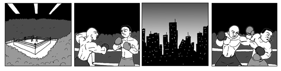
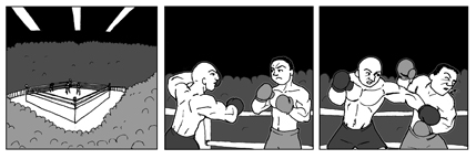
There you go, theorize away! If possible, try not only to explain what feels wrong, but what deeper reason you think might be causing it (that’s why I’ve presented several examples, so you can hone your analysis). Regardless, I’ll be interested to see what everyone comes up with.
Comments