Knowing the rules of comic page layouts
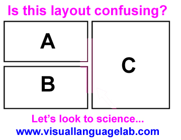
One of my more engaged-with blog posts of recent memory reviewed the data for whether the panel arrangement on the right was “confusing.” So, here’s a post with some additional thoughts on this and the “rules” of comic page layouts**…
First off, let me remind people that I’ve given this layout a name: When you have a vertical stack of panels next to a tall panel, I call it “blockage.” You can find terms (and science!) related to page layout in my book and my scientific papers (also linked throughout).
Most of the claims I make about page layouts are based on the experiments that I and others have done about them. For this layout, the key experimental findings came from two studies presenting people with empty page layouts, and then asking them to choose the order that they would read the panels.
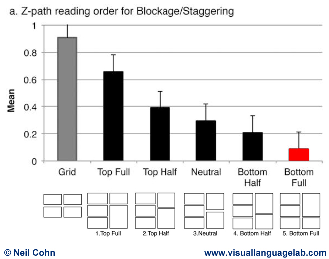 We found that for blockage layouts, around 90% say “down”. Or, conversely put, less than 10% of choices in these situations followed the “left-to-right-and-down” Z-path that follows the order of written text. As I said in my previous blog post, this rate is essentially the inverse of what we find for pure grids. In simple grids, we find 90% of responses choose to follow the Z-path (i.e., go right) instead of choosing other paths.
Now, one criticism people have about these studies is that they don’t have content in the layouts. Yes, these experiments presented empty panels, which might be different than if content is included. But, there’s a good reason for this: the question we were asking wasn’t “how do people read these layouts?” but rather “what are people’s preferences for ordering these layouts?” Having no content works just fine for doing good science and factoring out confounding variables, and it answers our question of whether people have preferences for orders: yes they clearly do.
So, these results show that readers have a preference for the proper reading direction. In other words, the “rule” in their minds is that, they should read downward in blockage layouts. You might think that the “rule” of reading comic page layouts is “left-to-right and down”, like text, and thus this layout is confusing. But, that’s not the rule. I’ll explain this more in a bit…
 When I say that “this layout is not confusing”, I mean that readers have these clear intuitions for what to do in these situations. The layout itself is not confusing, since people know what to do with it. What gives confusion then, is when creators don’t know or don’t obey this “go downward” rule, and still use layouts where blockage is read to the right. This could feasibly create confusion, since it treats this layout as “neutral” or like there isn’t a rule for its order.
However, there is a clear rule for it, and thinking it’s neutral is wrong according to the experimental results for what people say their preferences are. Grids aren’t used as if right and down are equal choices (though they’re even more physically ambiguous), and nor should this layout.
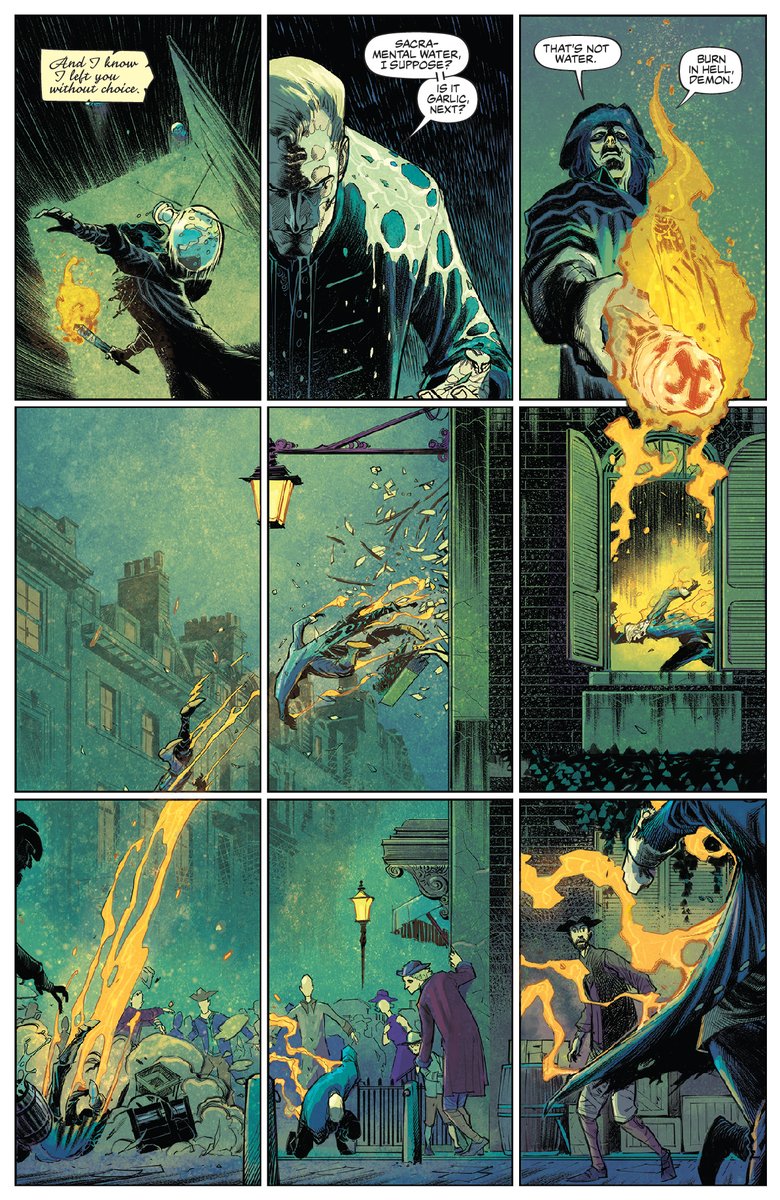
Certainly a creator can manipulate the reading path by using the content or balloons to go in a different directly. They do this all the time in effective and creative ways even with grids, like in the layout to the left. But, doing it against the downward path in blockage layouts have to be recognized as “breaking the rule” with artistic intent.
So, why isn’t “left to right and down” the real rule of layout? Well, it’s *one* rule in comic page layouts, but it’s just a surface choice within a broader overarching set of rules/principles.
Readers don’t just read a comic page to just go from panel to panel along the “surface” of the canvas making choices like right, down, etc. While it is likely that surface features like balloons and bubbles can “direct” the eye, layouts themselves have rules that are not dependent on these surface features, as demonstrated by the consistent results using empty layouts.
(Note: To my knowledge, there are no controlled experimental results showing that content directs readers’ eyes through layouts. There is one non-controlled study that has some hints about this though.)
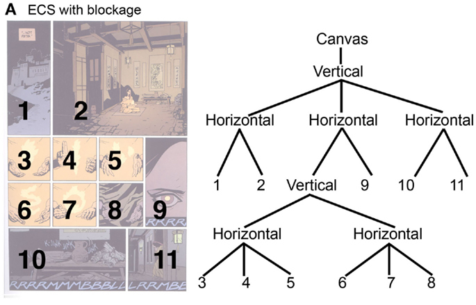
Here’s the actual rules of layout: Readers go through layouts guided by a desire to create grouped structures out of panels. The surface decisions that they make are on the basis of alignments between the edges of panels, but these choices are subservient to the larger goal of making hierarchic groupings.
I argue that these grouping mechanisms are what underlie readers choices when they move from panel to panel. This may involve some surface level rules, but there is an overarching principle I call “Assemblage” that has four basic sub-principles:
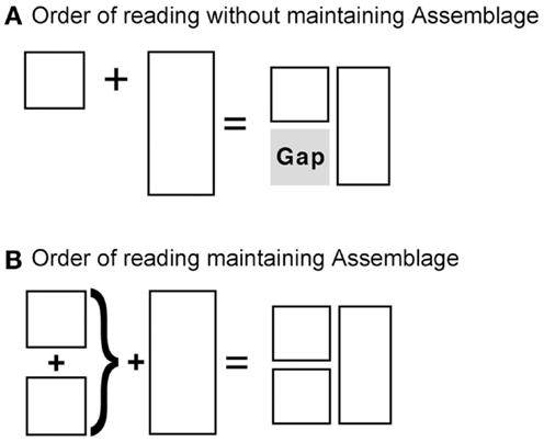
1. Grouped areas > non-grouped areas
2. Smooth paths > broken paths
3. Do not jump over units
4. Do not leave gaps
The reason so many people agree on going down in this layout is because it facilitates chunking the page into grouped structures, while the rightward path doesn’t, and a rightward path violates the Assemblage principles. This is why it’s a “rule.”
So, if you’re a comic creator, knowing what readers are trying to do while they read can help you design layouts, including how to break those rules with intent if you need to do so artistically.
**This originally appeared as a Twitter thread, and has now been expanded for blog format.
Comments