Dispelling myths about comics page layout

There are many websites and twitter accounts that give advice about how to draw comics, and perhaps no other piece of “advice” arises more than the repeated advocacy to avoid page layouts like the one in the image to the right. Advice-givers claim that this layout is confusing because a reader may not know whether to follow their usual left-to-right and down “Z-path” from A to C (resulting in a backtrack to B), or whether to go vertically from A to B, then to C. Because of this confusion, this layout is advised to be avoided at all costs, with the fervor of a grammar nazi for the visual language of comics.
This post aims to disentangle what we know and what we don’t know about this layout, how people navigate through it, and how it occurs in comics. I here report on what science tells us about this layout, not “gut feelings” or conventional wisdom.
First off, let me give this phenomenon a name. In my papers and my book, The Visual Language of Comics, I labeled this layout as “blockage” because the long vertical panel “blocks” the flow of horizontal navigation. I called the flipped version of this layout (long panel on the left, vertical stack on the right) “Reverse blockage” simply because it was named after.

Is this layout confusing?
I understand why people think that this layout is confusing. That’s why it was one of the key elements that I tested in the very first experiment I ever did about comics, conducted at Comic-Con International way back in 2004 (though it took many more years to write it up and get published).

In that first study, I presented people with empty page layouts—with no content in the panels—and asked them to number the panels in the order that they would read them. As in the graph to the side (red bar), blockage was chosen using the Z-path (horizontal reading) at only around 32% of the time. People used the vertical reading roughly 62-68% of the time (see details in the paper). This showed that people actually preferred the vertical reading by a 2 to 1 margin.
Also, one might note in the graph, of all the features we tested in the study, it was the most impactful on pushing people to not use the Z-path of reading. So, of all layout features, this one was the most consistent at pushing people away from the Z-path.
Now, admittedly, my first study was not that carefully controlled as an experiment. It was my first one, after all, and I did it before I even started my graduate training in experimental psychology. I essentially tested lots of different instances of this layout (among other aspects of layout), but I did not explicitly manipulate it to see what variables affect it. In particular, the relationship between vertical staggering and blockage was not clear. So, we did a second study…
In our follow up study (pdf), we more carefully manipulated the layouts to ask the question: what is the relationship between a blockage layout and a “staggered” layout where the gutters are merely discontinuous. We used several page “templates” with basic aspects of layouts that were then filled with our experimental manipulations, which modulated the height of the right-hand border:

I should note that this design meant that it was not obvious that we were testing this phenomenon (we also tested other aspects of layout too). People saw lots of different whole page layouts with lots of variations. This is important, because this attempted to make sure participants were not aware of what was being tested, and thus they could proceed in an unbiased nature (as was true in my first study, though less systematically controlled).
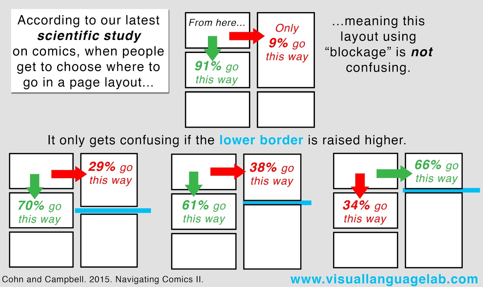
In this study, we found that in “pure blockage” arrangements (“Bottom full”), there was a rate of 91% to go down vertically, and only 9% to go horizontally. This could be modulated by raising the righthand gutter though. The higher the gutter was raised (i.e., the more the stagger), the more likely people were to go horizontally. The data were actually beautiful, and there’s another graph below that shows this.
If there is a rate of going vertical at 91%, this is pretty solid evidence that people prefer to read these arrangements vertically. This is not “confused”—there is overwhelmingly consistency. That’s why when I see people harping about avoiding this layout, I send around the graphic above and say “no, it’s not confusing! Feel free to use it!”
Now, one might say “But these data show that 1 out of 10 people will find this confusing! That’s still confusing! Don’t use it!” Let me unpack this. First off, almost no scientific study will show 100% of people doing something 100% of the time. Case in point: we didn’t even get 100% consistency in reading 2 x 2 panel grids, which should be obvious as to how to navigate (a point I’ll return to below).
Second, these data are not counts of people, but are averages across instances in the experiment (each person saw more than one version of the layout—we averaged across them), and then we took an average across participants to analyze. So, it’s not 1 out of 10 people, it’s that there is a mean rate of 91% for people go down rather than over across individual instances and people.

Third, if you you think that having a rate of 91%/9% is still “confusing” for people’s preferences, then bear in mind that’s roughly the same rate that people didn’t choose the Z-path for arrangements in a 2 x 2 grid that was also found throughout the experiment. The actual graph for our data is to the left. (As I said, it beautifully shows a stepwise pattern for the height of the gutter.) The rates at which people use the Z-path in blockage (red) and for the grid (grey) are essentially the inverse of each other.
In other words, the rate for going horizontal (Z-path) in blockage is the same as going vertical (non-Z-path) in pure grids. So, if you’re going to harp on blockage for being confusing, does that mean you’re also going to harp on basic grids for being confusing?
Caveats: What these experiments show is that people have intuitions for how to navigate through blockage (and other) layouts in consistent ways that are measurable and quantifiable. These experiments show what people’s preferences are; i.e., how they would consciously choose to navigate a layout. And, they do this by using layouts with no content.
It is certainly the case that navigating comics with content is different than those with empty panels. The inclusion of content may push people in different ways, which we can study (color, balloon placement, characters overlapping panels, etc.). But, this is exactly consistent with my theory about page layouts: there are many factors (“preference rules”) pushing around how you navigate. For example, if you colored panels A and C blue and colored B yellow, that visual feature might push you towards C instead of B.
However, this isn’t your basic preference. By testing empty panels that don’t have these additional influences, we can factor out these additional influences and get at people’s basic intuitions. This is how you do science: by isolating structures to understand their influences on a situation.
Finally, since these experiments tested people’s preferences, they don’t test people’s actual behavior. In the one study that has looked at people’s behavior with these layouts, a Japanese team found that eye-movements in these layouts caused more looks back and forth (“regressions”) than when those same panels were rearranged post hoc. Note though, there were several problems with this experiment (described here). Nevertheless, the results should not be discounted, and they imply that there may be a disconnect between what people’s behavior is (like eye-movements), and what their intuited preferences are for navigation. We’re currently doing studies to tease this apart.
What about comic reading experience?
One factor that might could possibly influence how people read comics is their experience. I’ve shown that the frequency with which people read comics can influence lots of things about how they’re comprehended, including people’s brain responses. There is a “fluency” for the visual language used in comics. Maybe this could extend to blockage layouts?

In my first experiment, the only thing that modulated whether people used the Z-path in blockage layouts was whether they had any comic reading experience at all. People who said they “never” read comics were significantly more likely to use the Z-path than those who read comics to any degree whatsoever. This is the dotted blue line in the graph to the right.
In our second study, we used a more sophisticated measurement of comic reading expertise called the Visual Language Fluency Index (VLFI) score, which I’ve used in many studies. We didn’t find any significant correlations between VLFI and blockage paths, but we did find an interesting trend. The statistics related to correlations (r-values) increased as the gutter got higher. This suggested that the more the layout used blockage, the more experience in reading comics seemed to matter. But, again, this wasn’t statistically significant.
What about different types of comics?
Another factor that might influence this layout is the degree to which it appears in comics of the world. Over the past several years, my students and I have been gathering data about properties from different comics around the world, and this is one of the things we’ve coded for.
The first study to code for properties of page layout in comics was done by my student, Kaitlin Pederson. She analyzed how page layouts have changed across the last 80 years of American superhero comics. The paper for this study should come out soon (EDIT: here it is), but here is her presentation on this material from Comic-Con of 2015. Essentially, she found that blockage occurs in fairly small proportions in American comics, but it has been increasing in how often it occurs in page layouts over time (that is, it’s being used more often more recently), but this trend was only approaching statistical significance.
If it is the case that blockage is increasing in usage over time, that would imply a corollary to cognition. We might expect younger readers (who experience it more) to have less of an issue with it than older readers (who experienced it less frequently). However, in neither study did we show correlations between the age of participants and blockage choices.
In more recent work, we’ve looked at layouts from across the world. This work isn’t published (Edit: here it is), but it was presented by my students at Comic-Con 2016. We found that blockage is used much more in Asian books (Japanese manga, Chinese manhua) than Western books (US superhero and Indy books, and books from France and Sweden). Paper hopefully being written up soon.
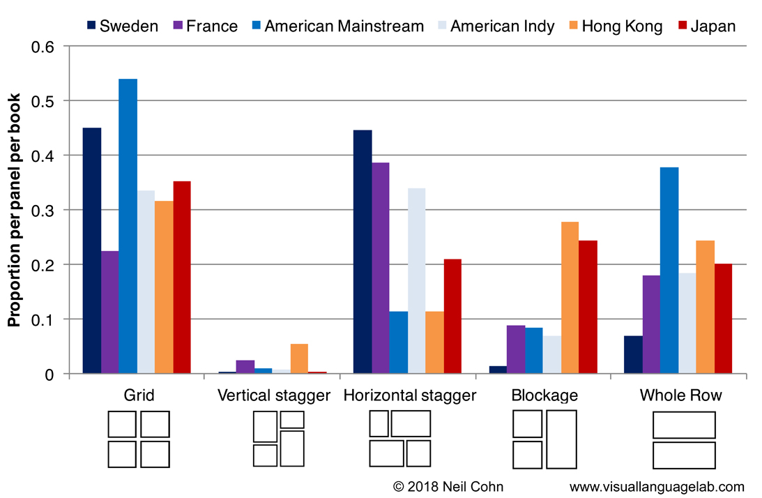
So, might it be the case that the rate at which people read manga (which use more blockage) impacts how they choose to navigate this layout? It doesn’t seem to be the case. In my first study, I found no impact of people’s reading frequency for manga on blockage layouts. This was actually a surprising finding for me, since my intuition was that blockage occurs more in manga (which we now seem to have data to support), and thus I figured experience reading manga matters. But, the data don’t bear this out. I also went back into the data for my second study and looked at whether manga reading had an impact: Nope, no influence.
So, yes, this does vary across comics from different cultures and time periods. However—at least so far (and this could change with more studies)—it seems that the types of comics you read do not impact how you navigate pages. I’ll also note, this is different than some other recent findings I have showing that the types of comics you read does impact how your brain comprehends image sequences (EDIT: Like this one).
Closing thoughts
In this post, I’ve discussed what science—not conventional wisdom or hearsay—tells us about “blockage” layouts. I’ve discussed data from two experiments published in peer-reviewed journals, which show that people are fairly consistent about how they choose to navigate these layouts—at least as consistent as people navigate through grids. This navigation is modulated somewhat by having experience reading comics, but not overwhelmingly. It also seems unaffected by which types of comics people read, even though it appears more in Asian books than Western ones.
At the outset of this post I likened harping on avoiding blockage layouts akin to being a “grammar nazi.” I actually think this is an apt analogy. Like blockage, most of the so called “rules” of language upheld by grammar nazis are not actually rules of English grammar. They’re gospels hammered into people through rote conditioning, but have little reality in the way English is structured or comprehended. This is the visual language equivalent of one of these “rules.”
So, I again say: this is not an overly problematic layout and people are making much ado about nothing. Feel free to use it without worry that people will be confused by it. The visual language of comics is incredibly complex and multifaceted in its structure, and the most complicated and impactful aspects of this structure usually go unnoticed or un-commented on by critics and creators alike. In the scope of that complexity, this layout is fairly minor in terms of people’s comprehension of comics. Perhaps it’s time to focus on other things?
Comments
According to your research, if I use your "bottom full" blockage layout, 9% readers will select the wrong panel order, compared to none if I use a layout following standard left-to-right rules. I wouldn't call that "not confusing".
I do use a layout like that once in a great while, because sometimes I need panels in that shape in that order. But when I do, I always use some other visual cues (e.g. line of action leading the eye, an overlapping word balloon, or [gods forgive me] an arrow) to make sure that it's more like 1% that get confused.
As I explained in the article, 9% is not 9% of readers, it's the rate of reading a particular path given the total number of instances, averaged across individuals and all participants.
That said, as I also said: the rate of going vertically in a blockage layout is roughly the same as the rate of going horizontal in a grid layout. They had the same "error" rate in this experiment. So, you should feel just as confident that someone will know the default order of where to go when you use a blockage layout (vertical) as in a grid (horizontal). What's "confusing" is when you use any layout that goes against those default assumptions.
I still don't get why your assertion that "everyone has a 9% chance to misread your layout" is better than "9% of people will definitely misread your layout". Grids can easily become more readable simply by widening the horizontal gutter minimally, as people have been doing for years since manga popularised the tecnique. Then you'll get a near 0% error on grids due to perceived proximity grouping A and B together more strongly tha A and C. But this will likely have no appreciable change in blockage layout failure rates.
You could increase legibility of blockage layouts by widening the vertical gutter between and narrowing the horizontal gutter, but then you risk your draughtmanship looking incompetent, with varying gutter sizes in both orientations.
The best answer, in my opinion, is to not use sterile puzzle pieces that, when equidistant from each other, create a 2×3 rectangle. This study does not take into account hundreds of techniques available to artists to increase legibility. Use blocking layouts if you want to, manga does it all the time, and there are dozens of ways to make them flow seamlessly, but don't buy in that 91% of people putting boxes in the correct order as anything reflective of the comic reading experience. I applaud the effort, but you ignored too many variables to consider this comic research.
If you were to read the actual article, you would see that we also have tested gutter width and its affect on panel ordering. Again, this manipulation in these experimental circumstances does not create "near 0% error", nor have I said that "everyone has a 9% chance to misread your layout."
Layout is very complicated. In these studies, we've tested quite a number of factors which require stripping down that complexity in order to better isolate which elements are have which influences. In fact, I've tested and characterized more aspects of layout than anyone else has. I don't consider this work to be "done", but it's easy to say that "X will inevitably solve this issue" or will lead to some sort of reliable result in the absence of any actual data and testing. These results here aren't hearsay or made up statistics. They're the actual results of careful experiments. Science is hard, opinions are easy.
It's worth bering in mind that Manga page layout, like pretty much every aspect of Japanese art and design, is crafted along very specific rules, which I would assume in the case of Manga is related to having to remove ambiguity from a language that's read right to left, and can be horizontal or vertical. If you know the why of the manga design idiom, there's pretty much zero chance for ambiguity. It's a rule-based mechanical layout language, rather than relying on aesthetics, intuition or the reader making connections based on the contents of the frame.
Manga design follows a single rule (assuming a Japanese right to left reading direction) – scan from top right to bottom left, find the first continuous edge to edge gutter (horizontal or vertical), divide the page at that point, and then reapply the same rule recursively within that division until all frames are exhausted, the move on tho the next top level division.
Inherent to Manga layouts is that so long as you know if it is right to left, or left to right, no content is necessary to unambiguously discern the panel order.
Long version with diagrams here.
Thanks for the comment and the link Metaning. From the look of your longer version, what you're talking about is the same sorts of groupings that I describe in my original paper on page layout structure, which posited a hierarchic and rule-based underlying structure of layouts on the basis of cues from panel alignments (such as staggering or blockage). It sounds like you're describing largely the same ideas, just illustrated in different ways.
I've argued that those rules apply to not just manga, but also to most all comics (though the particulars of the rules might vary cross-culturally… we're still working on figuring that out).
The key thing that I think that is the most powerful differentiator between Manga and western comics, is that in Manga you almost never have edge-to-edge horizontal and vertical gutters intersecting, because that creates an ambiguity. There's always an offset to indicate a perpendicular gutter is functionally inside the block delineated by the dominant gutter, and not connected to the other side.
As far as I know, the "edge-to-edge and divide recursive" rule in Manga is a specific solution to the problem that Japanese has no one correct orientation for text, so unlike western comics you can't just assume the reader will read horizontal, then vertical.
Personally, I think that by being a self-contained mechanical design language, it has a utility that is cross-cultural, and offers a more effective user-interface to the content, than the western alternative, at the cost of theoretically requiring a little more up-front knowledge on the part of the reader.
Suggesting there is an objectively better way for westerners to design their layouts, sourced from a non-western comics culture no less, can however get a pretty hostile response at times, so it's interesting to see you quantifying some of those ideas.
I think the best parallel is English vs Latin – the rigid structure of Latin, for people who know how it works, makes it an inherently ambiguity-proof language, whereas English has so many back-ported varieties, creoles and pidgins that it requires work & care to obtain specificity.
Choosing your preferred flow of empty boxes is not the same as reading. Did you actually test these theories of yours with content? Maybe I missed it, but it seems you just tested the boxes. Maybe if you worked out three panels where the second and third could be read in either order and had people read them out loud to see how they actually read?
@Darth Prefect would you experiment with ordering words in a sentence in various orders, and leave it up to the reader to work out the correct order? That's the point of using a design formula that doesn't involve the content – think of panels as the gramatical structure of the page language. The grammar is unrelated to the actual words, it merely defines the correct order of subject, object and verb etc.
Fun side note – while some languages like english are of a *subject* *verb* *object* structure – *I* *open* *the door*, and others like Latin are *subject* *object* *verb* – *I* *the door* *open*, non-verbal hand signal communication seems to be subject object verb universally, regardless of the structure of the person's spoken language.
The goal, IMHO should be that the reader never has to read the content of a panel, to know the order of the panels. By using a strict design language, you remove the cognitive loading on the user to figure out which panel is next, and gain a better control of the linearity of the narrative – preventing the reader from having a panel spoiled because they'd jumped one ahead on an ambiguous design.
Hmmmmm, I think the error you make is that you consider the individual page in isolation. In an actual comic book the majority of pages do not have blocking. Thus the user is trained to use Z-ordering. But then they come to a page *with* blocking. The presence of blocking, as you established, makes it natural for the reader to abandon the Z-order and read vertically. Even in the case where the panels are organised grid-like in the top of the page and blocking only happens in the bottom of the page, 34% of readers on such a page would want to go down from a top left panel than right. Thus ambiguity is created, by the conflict between the Z-ordering in the rest of the book and the vertical ordering in the blocking book.
What I think you have observed is really that comic readers understand that comics can be either Z-ordered or vertical, and the presence of blocking is usually an indicator that the comic itself is vertical – in which case the blocking is unproblematic. It would be interesting to ask which panel the 91% of readers that went down from the first panel went to *next* – if they continued to go down, this would be very undesirable for most conventionally Z-ordered booked.