Igor Kordey’s “Design of comics”
This morning I found this very fun post by Designboom about a talk given by the Croatian comic art Igor Kordey about his page design and storytelling. The post and Kordey’s talk are both interesting and entertaining, and Kordey’s pages are simply beautiful. That alone is worth the price of admission. However, what I found really interesting was that he identifies several specific designs and techniques throughout his practice, many of which I’ve discussed in my book and papers. I could talk about every page he shows in a lot of detail, but I’ll break down a few of his points.
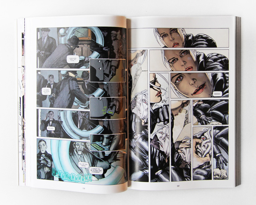
First off, many of his layouts simply involve symmetrical inversions of structure. So, if there are three horizontal panels on top, he’ll have three vertical ones on the bottom. If there is a blockage arrangement on top (two vertically stacked next to a large panel to their right), then he’ll do a reverse blockage layout on the bottom (large panel on left, two vertical stacked to their right).
In other pages he prefers to keep the layout constant, with different types of grids, but then to manipulate the content inside. A recurring theme is to keep the panel content from the same perspective (say, a lateral view) with several non-moving objects and one that moves, while then flipping the perspective in only a few panels of the page. (Notably, doing this in his third example page, it violates the 180º rule between nearly every panel on the page, yet he makes no mention or care of it). Across all of these, we might say he follows a rule of “same-except”: they’re the same, except different in some particular dimension.
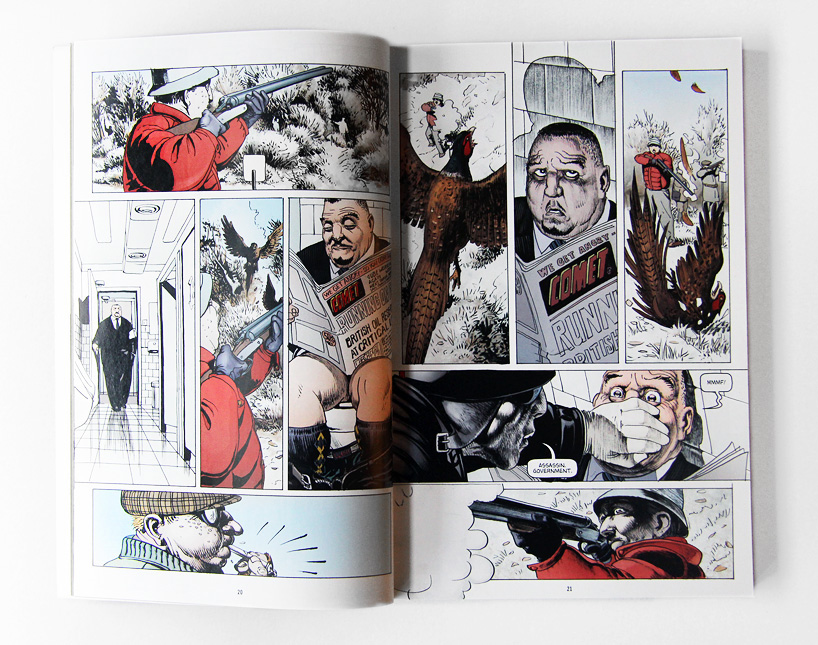
He also describes more specific techniques. In one sequence, he describes how the panels shift back and forth between showing a hunter killing a bird and a politician being assassinated (his example two page spread comes after the pages below—no image available, but it’s in the video of his presentation). In film theory, this type of flipping back and forth is called “parallel-cutting” or “cross-cutting,” but I’ve called it “multi-tracking,” “polytaxis,” or “alternation” (depending on certain features of the alternating panels).
I actually spend some space in my book discussing these types of patterns, and show that they recur in several different types of comics (I have a whole folder full of them from different books). As I mention in the book, they are a good example of an abstract memorized pattern found across sequences of images, rather than just patterns found in the the “vocabulary” of images’ content (like how hands or upfixes are drawn).
Another particularly striking page that he discusses uses what he calls a “fishbone” layout, which is depicted in the image below on the right side:
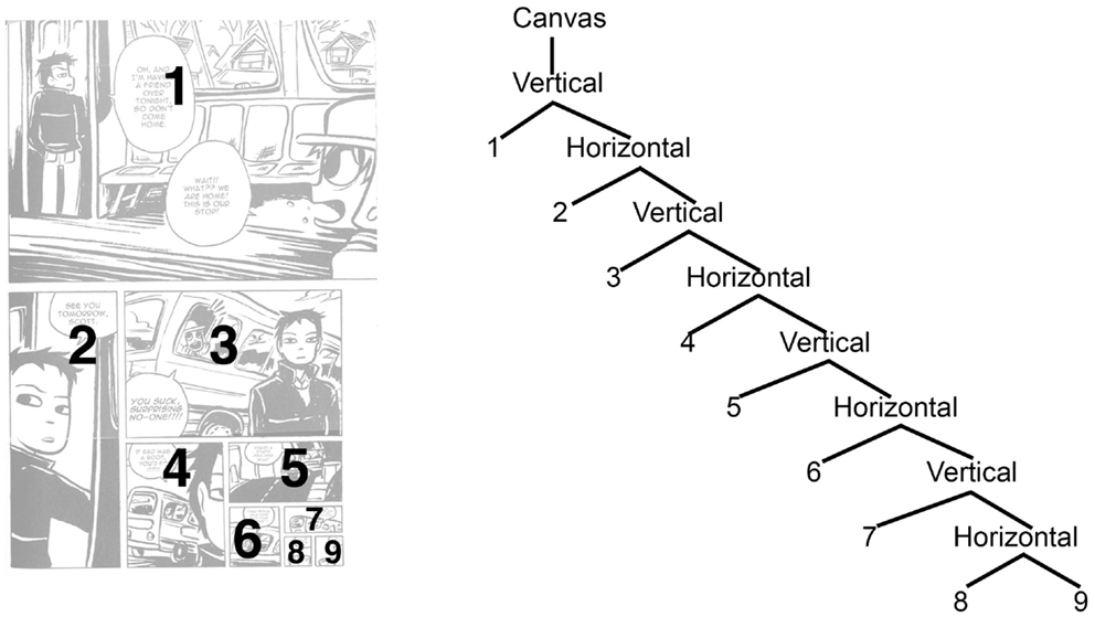
This sequence uses alternating horizontal and vertical panels that descend as one progresses through the page. He says that he’s never seen it in any other comic, but I got very excited seeing this page, since I remembered drawing pages like this (and his next page) when I was experimenting with my own comics in college a decade ago. In addition, I discussed a similar page specifically in my paper on the structure of page layouts from the comic Scott Pilgrim:
The layout in the Scott Pilgrim page is structurally the same as Kordey’s—also with 9 panels!—but Kordey’s uses panels of almost equal sizes, whereas those in Scott Pilgrim shrink with every new panel. The effect in Kordey’s makes it a fairly “clean design” and his content mirrors this with the horizontal panels showing images of one character looking up at another, while the vertical panels show their vertical relationship (one on top of the other). In Scott Pilgrim, the shrinking panels also mirror the content—the character is getting off of a bus which then drives off in the distance, so the size of panels reduces as the distance grows greater.
To the left of the Scott Pilgrim page, you can see the actual structure of these pages. Layouts in general are structured so that vertical and horizontal structures embed inside each other (see my book or paper on layout for details). While Kordey emphasizes the back-and-forth between the content in his vertical and horizontal panels, what makes these pages interesting is not just that panels alternate from horizontal to vertical, but that each panel creates a new tier in which the later panels are embedded. Layouts like these create a “right-branching tree structure”—and the descent in the tree diagram shows the feeling of the descent in the layout.
There is no image for it on the page, but his next example in the video is the subsequent page where he reverses the “fishbone” so that the panels expand. This then flips the layout, with a more “expanding” feeling resulting. The structure for this would be the exact reverse of the “right-branching tree” and would instead be a “left-branching tree,” which again could directly show why the feeling of “expansion” occurs in its structure.
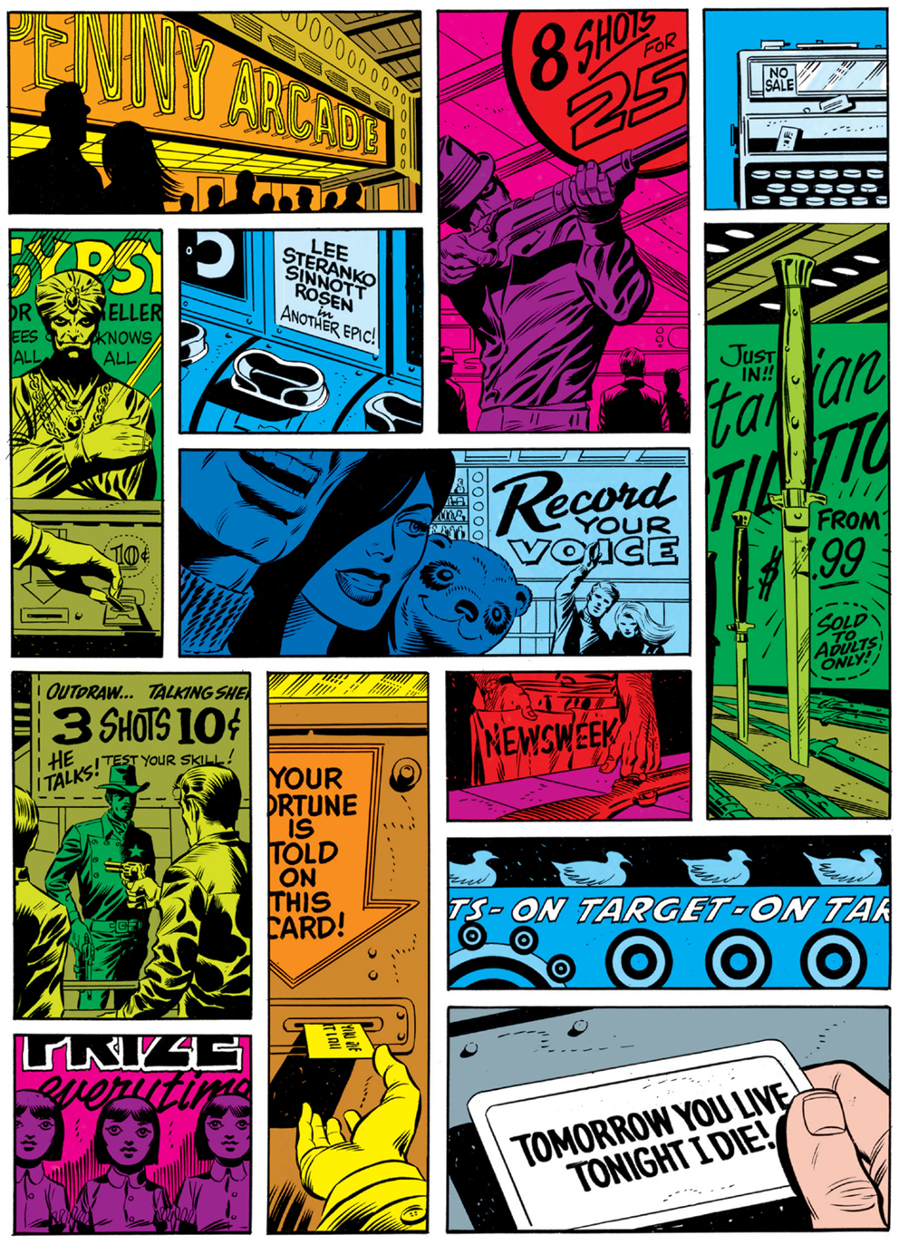
One of his final pages actually belies the system of embedding panels in layouts, since the borders of the panels overlap each other, similar to the Steranko page to the right (again, discussed in my paper on layout). In fact, his whole page design is the same as the five panels in the upper left of Steranko’s layout which look almost like a pinwheel, or as Kordey calls it, the “swastika” layout.
As Kordey suggests, these layouts are much harder to navigate, since they belie the normal rules of reading layouts.** However, the content allows this, since there is almost no progression of time between the panels, meaning that the linear order is less important. In my narrative structure, I would say that these panels are “conjoined” within the same clause and thus can be rearranged in their order with little effect on the coherence of the sequence.
This seems to be Kordey’s main point throughout: that the structure of the “storytelling” and the structure of the “layout” should reinforce each other. I think my theory would agree with this, since both narrative and layout create “tree structures,” and it makes sense that when both have similar structures, it should create either “easier” processing or maybe a seemingly more aesthetic response (we’d have to do experiments to find out for sure).
And… I’d add that having a well-developed theory of these structures allows us to directly show these insights of a brilliant comic artist like Kordey.
———–
** Note: A supplement to my original page layout paper (pdf) shows that, though the whole the Steranko page poses challenges, comic readers still have consistent patterns by which they preferentially navigate it.


Comments